Many Tears Animal Rescue

As a hypothetical design challenge I planned a re-design of the Many Tears Animal Rescue website.

I needed to make sure that the website helped people to:

  • Connect with the dogs available for adoption
  • Highlight the ways to get involved
  • Serve as a hub for their community

Goals

Many Tears Animal Rescue work to re-home dogs that have been neglected by puppy farmers. The charity does a lot of really great work to advocate for animal rights and utilises social media well to craft a strong sense of community. 

Their website is used to educate people on the plight of puppy farmed dogs, advertise dogs available for adoption and raise money.

I started my investigation of their website by conducting a SWOT analysis to make sure I had a good understanding of what areas of the website are working well and what could be improved.

Website

My initial insights about the website were:

  • Feels busy
  • Not mobile friendly / unresponsive
  • Confused user journey
  • Images of dogs are difficult to see
  • Dog search is awkward to use
  • Messy IA
  • Multiple ways to find the same thing- navigation duplication

The website has a lot of great content that is unfortunately being lost due to a busy user interface and messy architecture. This is a detriment to the animals that need to be adopted. To combat this the site needs:

  • Information architecture 
  • Simple navigation and user journey
  • Visual hierarchy, and
  • Responsive on mobile

Current site content sort

As this is a hypothetical re-design to help me flex my UX muscles I don't have access to a lot of the important information needed for a full website audit. Given access to analytics for the website I would be able to see which pages are not performing and which pages people are finding useful. ​

Despite this I was able to go through the website to list the content and re-sort each item to streamline the user journey. I wanted to make sure that the goals of Many Tears were highlighted and easy to access for their users.

  • For adoption
    • Dogs
    • Search
    • Reserved dogs
    • Cats
    • Animals
  • Procedures
    • Forms
    • Matchmaker service - hidden in something that looks like an ad
  • About Many Tears
    • FAQ
    • History
    • Personal message
    • Contact - map
    • In the news - can cull old news / make news more prominent
  • Get involved
    • Youtube channel
    • Donate page - various campaigns
    • Scratch cards
    • Sponsor a kennel
    • Amazon wish list
    • Work for them
    • Shop
    • Training / advice
    • Foster
    • Forum
    • Become member
    • Happy endings
    • Ways to help - Loads!
  • Blog
    • Events
    • Thank yous 
    • Poems
    • Raffles
    • Sylvia's diary

Competitor research

I spent some time looking at the following websites to see how they tackle the challenge of homing rescue dogs.

After looking at a few other animal re-homing charities I noticed a few re-occurring themes.

  • Each of these sites uses large high quality images to encourage empathy and a connection between the user and animals
  • Responsive design on majority of sites
  • Strong branding - colours - logo - mission statement
  • Clear layout / CTA's
  • Content organised clearly
  • Community feeling with events / news / get involved sections
  • Donation prominent / wish list's
  • Social media used well - Instagram, Facebook etc.

Stakeholder interview

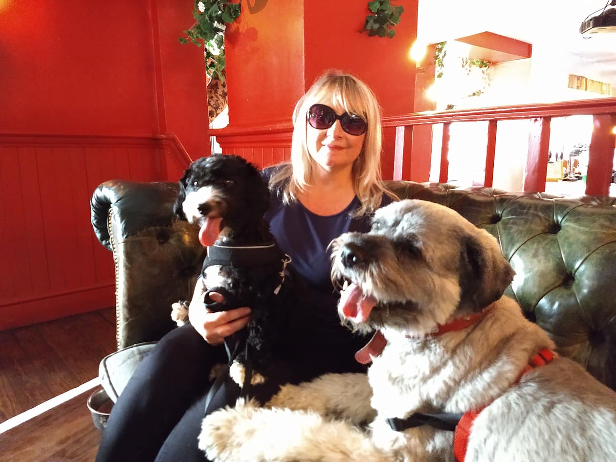
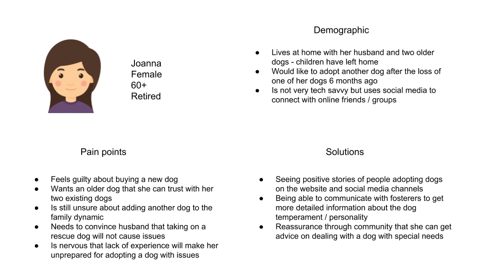
I sat down with someone that had used the website to adopt a puppy after the loss of one of their dogs. They had difficult considerations with adopting a new dog as they had to be sure the new family member would fit into the existing dynamic in the household.


Have you used the many tears website before?

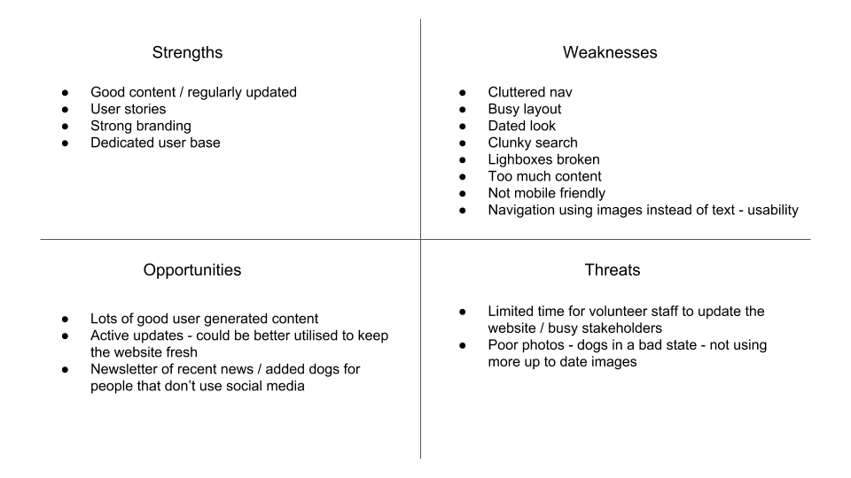
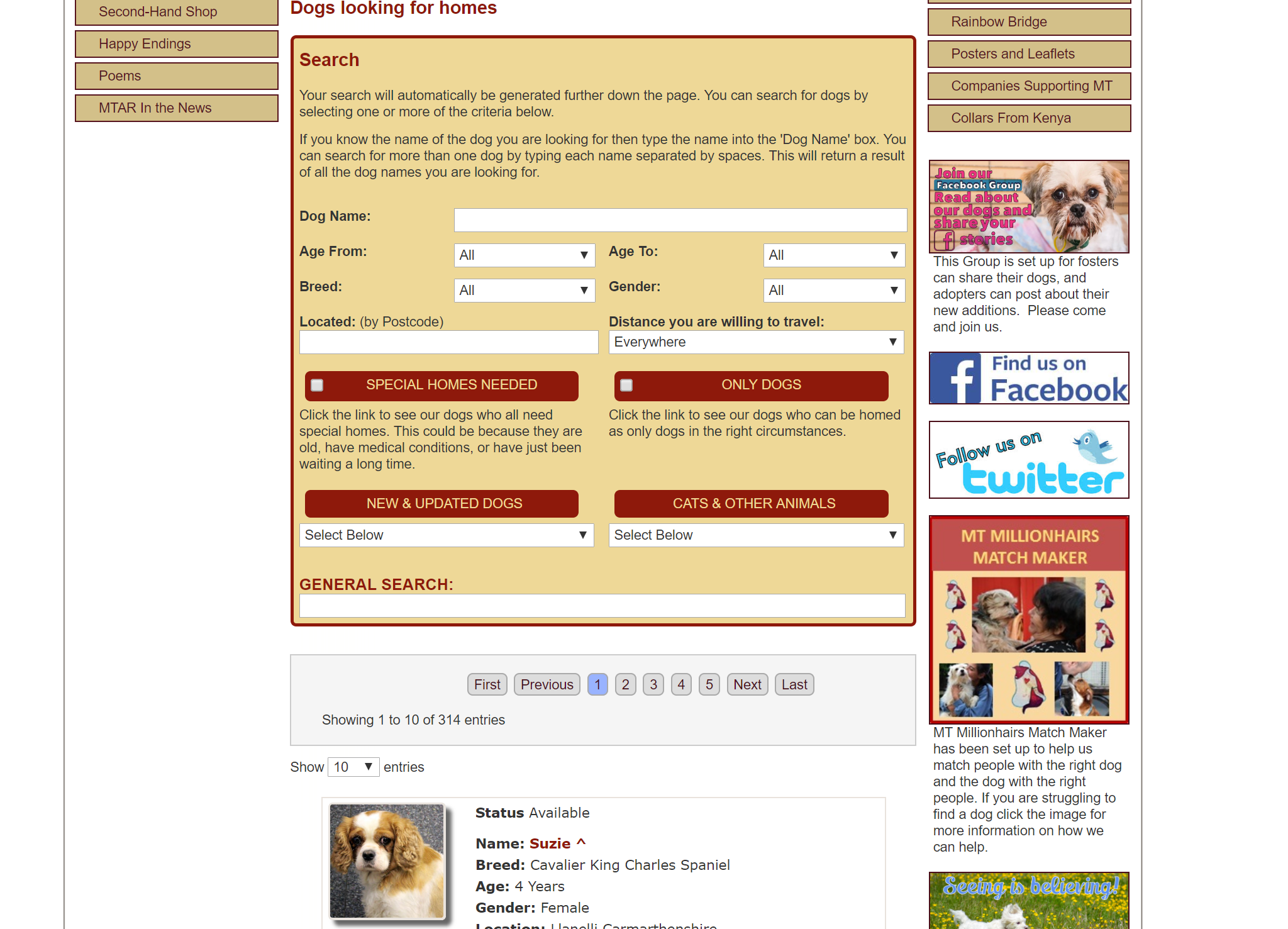
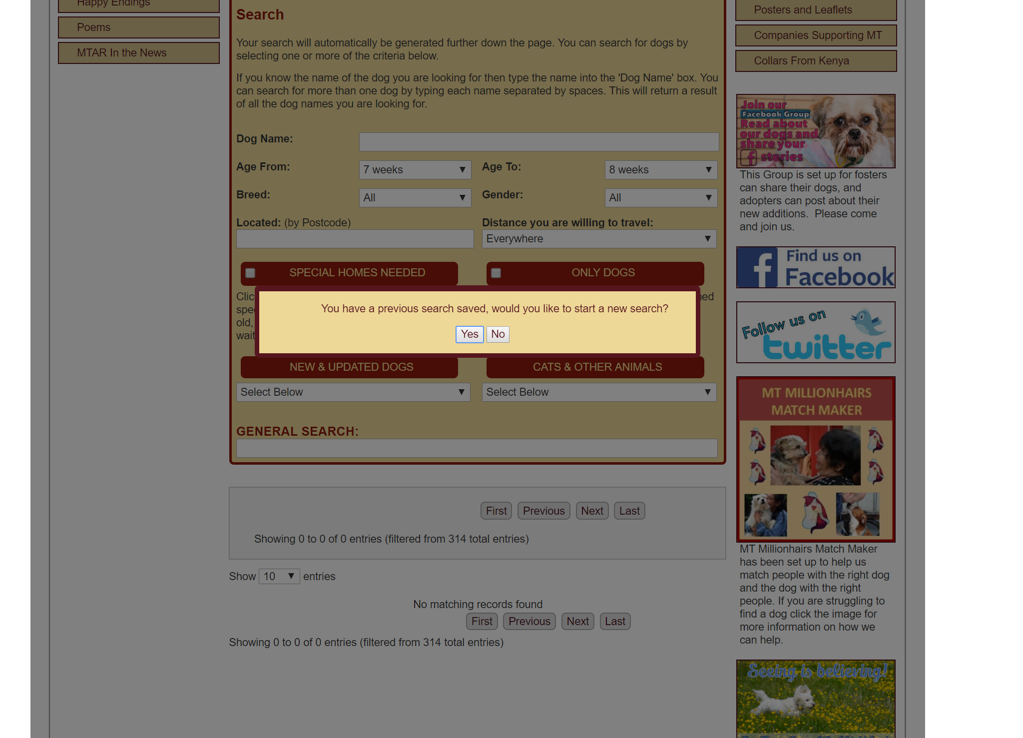
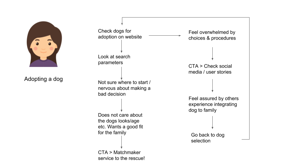
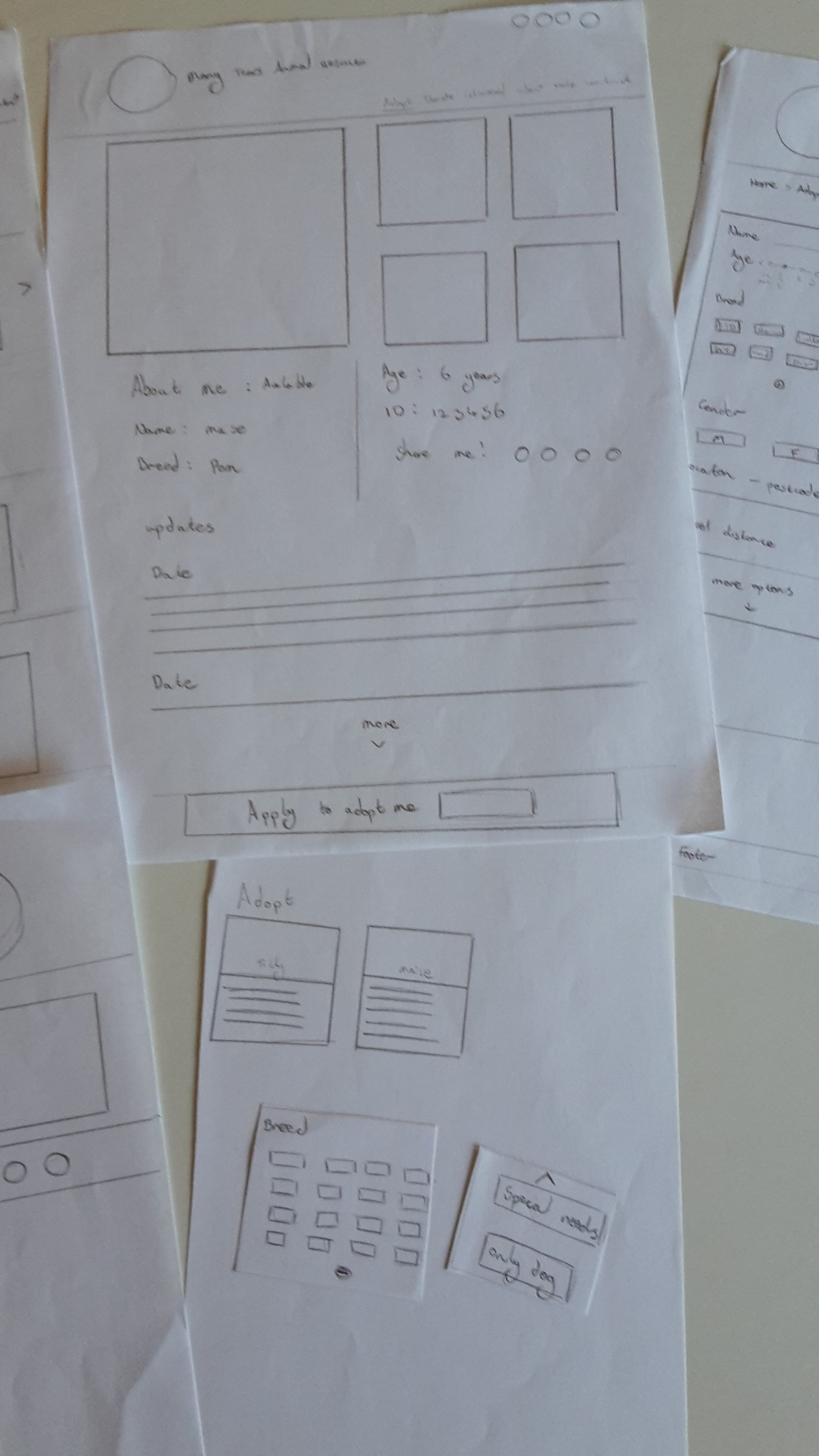
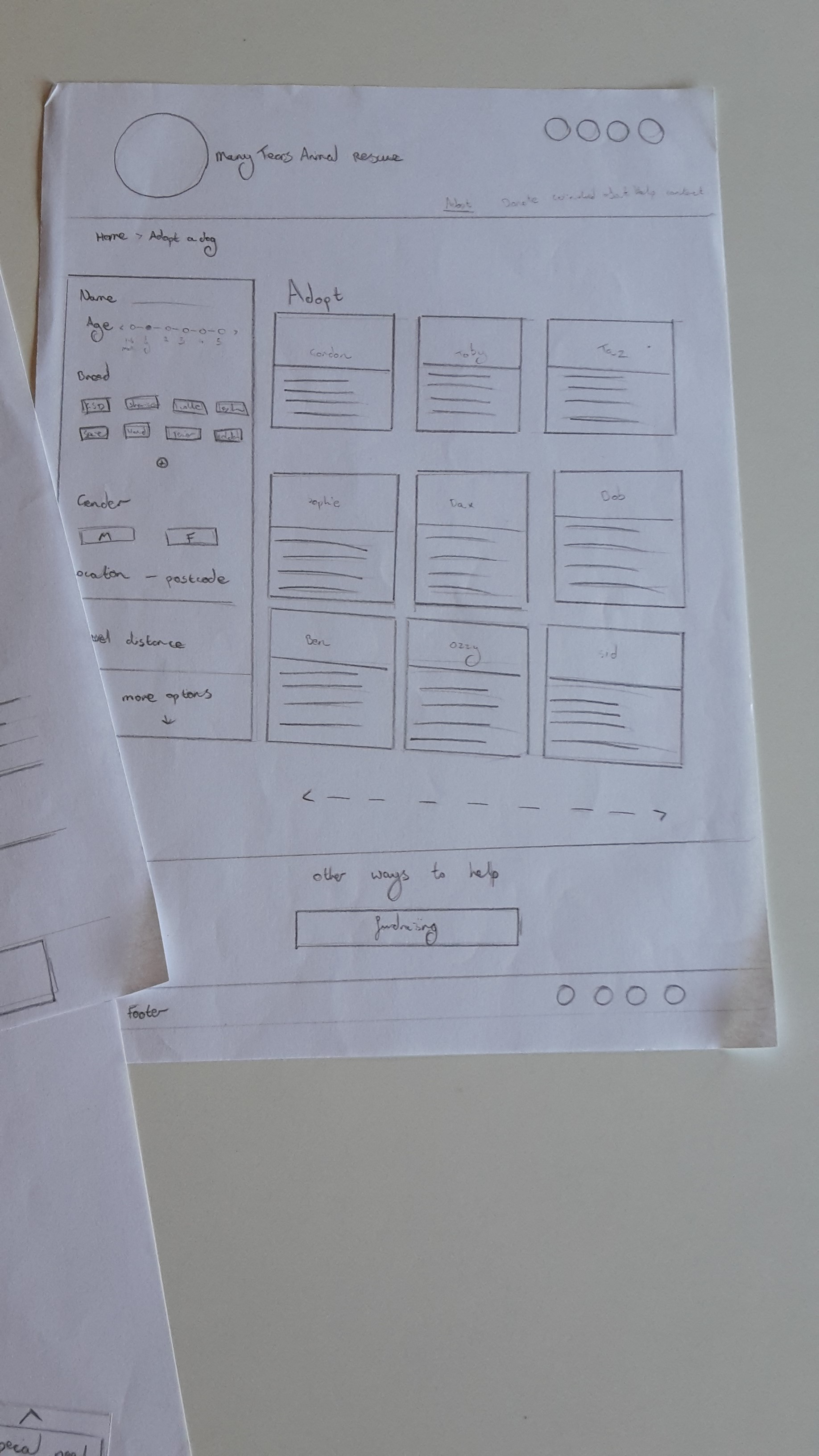
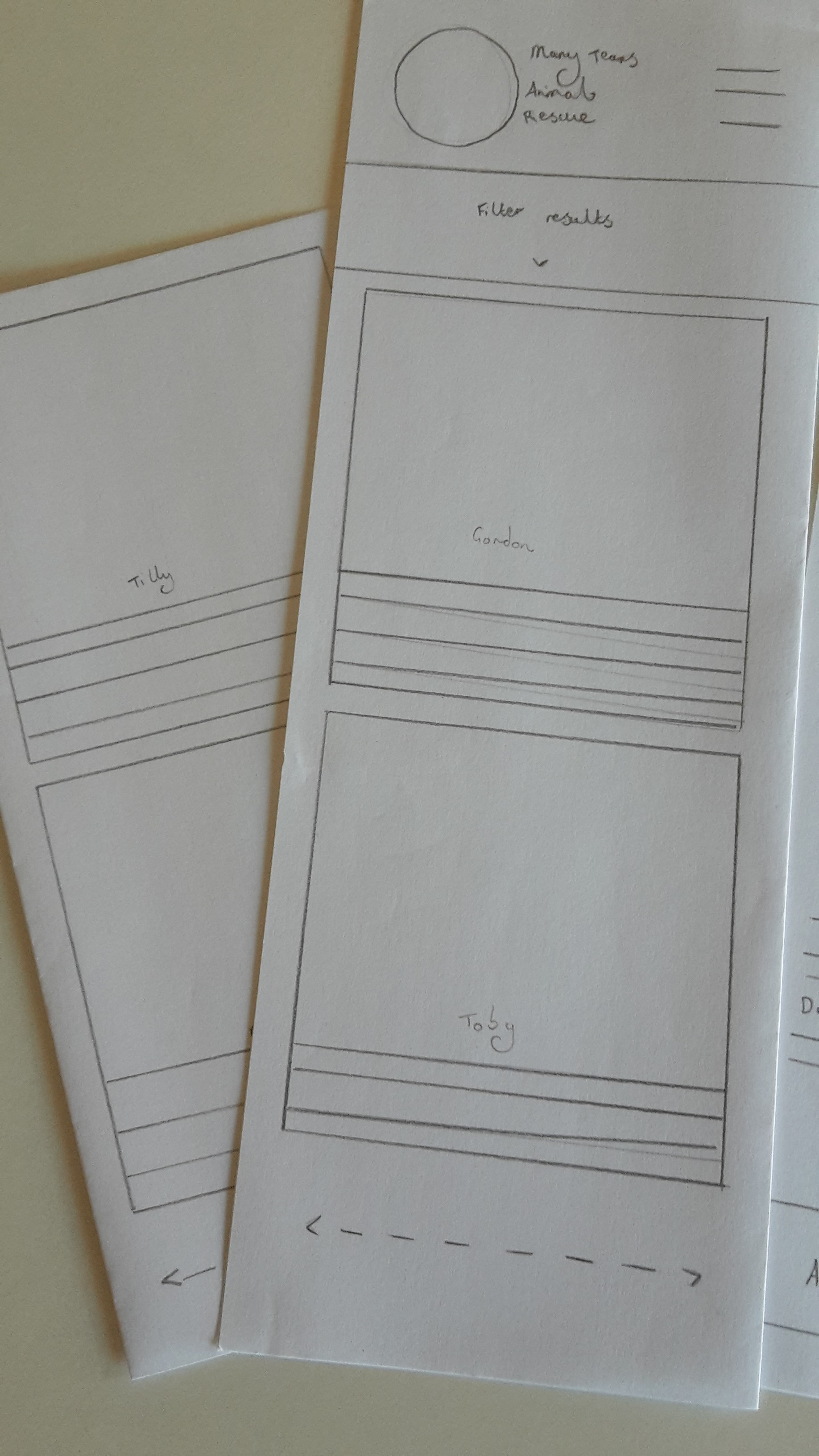
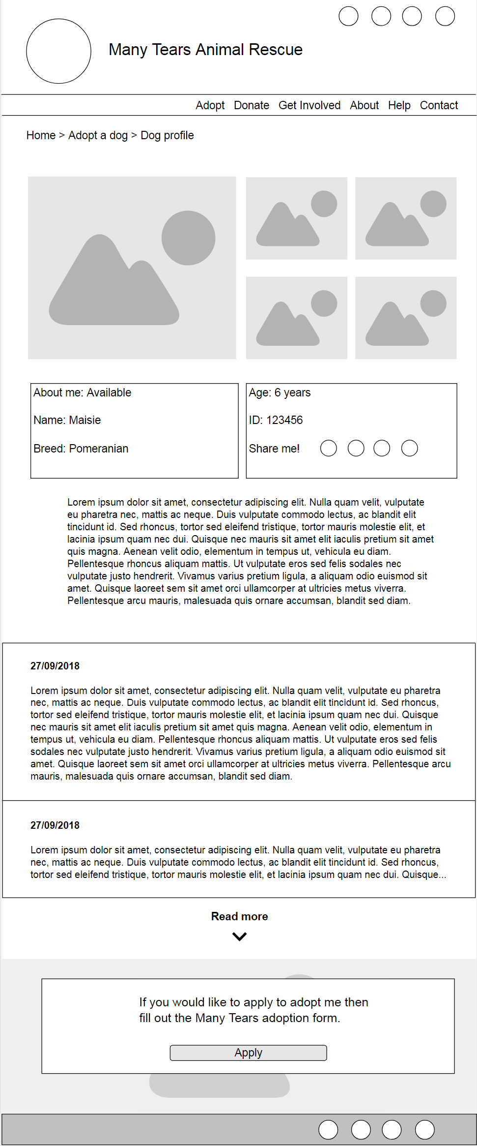
Yes I used my mobile many times to look at the merchandise and search functionality to search for dogs. I used all of the options for the search which was helpful but I found the search to be ‘long winded’ and difficult to get back to the main list once used.

Are you active on their social media?

Yes I make and like posts. I found out about Many Tears through Facebook. Facebook helped me link up with a fosterer near me for more information which helped me to learn more about a dog I had been looking at on the website. I liked that they were not too far away for our older dog to travel to meet them, and was given more information about the new puppy which helped sway my decision to adopt.

How was your experience using the Many tears website?

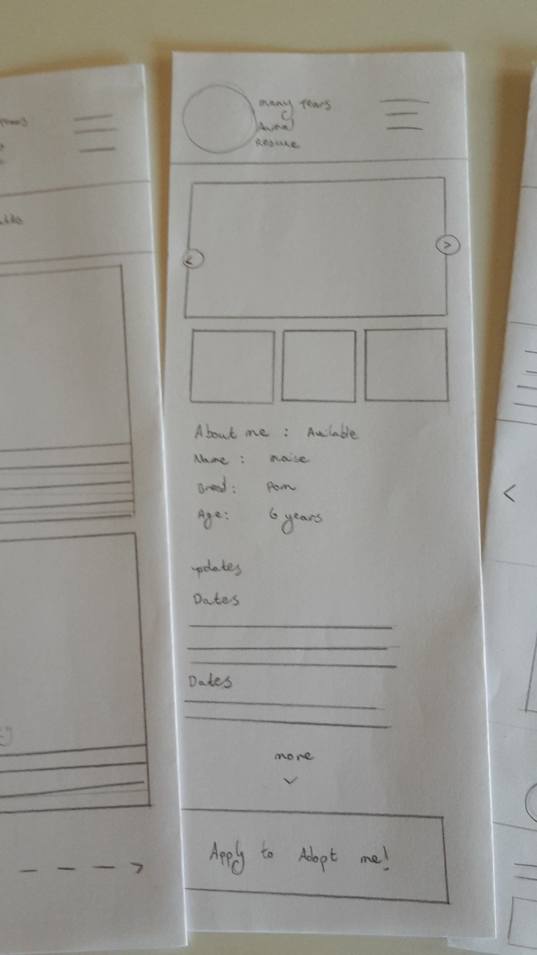
Liked the search options (age range, breed etc.) but photos need more information on the size of the dog as we had no idea what we were getting until the day we went to pick him up.

What would you change?

Would be nice to have more information on dogs personality as we wanted a dog that would be okay with our senior dog.

Would you use the Many Tears website again?

Yes I like that it is age specific, being able to search breeds etc.

Like that they have ex puppy farm dogs as this is a cause that is close to my heart.

There is less risk as you know the dogs background. You can turn to people with experience to learn about their potential issues and how to handle the dogs. The community feeling makes it feel less scary.

Having a puppy farm rescue is a good way of informing members of the public about these issues. You can tell people that they can rescue a designer dog and you don’t need to pay a breeder the money. Using Many Tears can steer people away from breeders.

Insights

  • Uses mobile
  • Utilised search functionality
  • Found search a little bit difficult to use
  • Nervous about adopting a dog
  • Reached out to community for advice and help
  • Used social media to connect with foster 
  • Cares deeply about the cause

As well as the interview I spent time on their social media channels to get a feel for the re-occurring comments, questions and requests were.

The main comments centred on the websites functionality, where to find features, how to use the website on mobile, and requesting others experiences with rescue dogs.

Persona & use case

I wanted to make sure that the website solves the issues that potential users may have in a straightforward way. I came up with Joanna who is retired and looking to add another dog to the family.

I then created a use case for my potential adopter that took into account their potential thought process. From my insights I realised that users may visit the site looking to adopt a dog but find it difficult to make decisions based on temperament, age, breed or needs. This lead me to adding calls to action that help our user to move through the site and quickly find what they are looking for. 

Paper prototype testing

To be able to quickly test the validity of my design decisions I ran a quick paper prototyping session with another stakeholder. I asked them to please find a Pomeranian named Maisie that was on the 'website'.

Insights

Following the session I realised that there were certain elements that could be improved upon.

  • Search filters needed tweaking to be more mobile friendly
  • Add more dog cards to mobile search results
  • Moving some elements on the homepage would streamline content

Wireframe iteration

Following my testing session I was able to put together some low-fidelity wireframes for desktop and mobile devices that incorporated all of my research thus far. I made sure that the layout would be easy to navigate, added CTAs to keep the user moving through the website, and conformed to existing mental models with the design. For the search filters I made sure that the user would not be overwhelmed by options and hid the potentially lesser used options to make it easier to use.

Branding

To make sure that the branding would be cohesive with the new design I put together a style tile to lay out the colour palette and potential imagery. This exercise is a good way of maintaining a strong visual language across their different channels (website, social media, marketing materials) as it provides a hub of information to refer back to. I have put together a basic version of a style tile that I could expand upon, and use as a method of communicating the fundamental elements of the design when creating high-fidelity wireframes.